

I love these covers! So detailed and eye catching with the white,silver,black and red!
|
N/A
|
The colors are beautiful and this cover is way better then the previous ones to this series.
|
NA
|

This cover gives a tragic story feeling which I hope is what they were shooting for. Like the font.
|
NA
|

To busy for me with all the colors but the male model is not to hard on the eyes.
|
NA
|

Another simple but strong cover. Love these colors and her dress.
|
NA
|

I love the background to this cover,very eyecatching. The girl is stunning with her innocent look. |

Beautiful colors. I love the sunset and how the font color blends perfectly. A great addition to the series.
|
First, I was drawn to the man then the backgound. Oh..and the tattoo and his butt are rather delish too!
|

Brandi's Take
|
||
Not crazy about the red font, but the rest is beautiful. Her position manages to say, I am in charge and come get me all at the same time!
|
Stunning! I love the wings.It's like you could reach out and feel the softness of them.The pinks and purples add to the softness.
|

Great addition. It has just enough of a new look to symbolize spin off while still fitting in nicely with the redesign of the Fever covers
|
Fits the title perfect. I like how the ice covers the scene like looking thru a broken piece of glass.
|

Lenore's Take
|
||
I cannot really tell what is going on here. I agree with the author that it has a Scooby Doo vibe and I am not loving it. The color is pretty enough but does not work here.
|
Not crazy over this one. Very dark and I think it takes away from the title of the book with it going verticle.
|

Loving the model's position. Sexy and dominate! I am not getting a fantasy vibe here, but I can defiantly tell that it is steampunk
|
Nice! Love this one with the setting and the colors. Her leg up really brings out the sexy couple.
|

I wish Toby was doing something a little more than standing around. The colors are nice, but almost wash out her face. However, it goes well with the others in the series.
|
When I see Seanann's covers I always think Urban Fantasy. I like how it really focuses on the girl and the color effects complement one another.
|

I like the pearly looking texture of the cover and how her hair blends into the shimmer. I think fairy more than angels though
|
Before I even saw the title I thought angel. This is a beautiful cover with the gold and purple and I like the title being written in soft simple script.
|

Brandi's Take
|
Author Exclaims
|
|
Love this cover. It fits the title perfectly. I think they really captured the vibe of this anthology
|
Very Elegant! Beautiful model and the edging around the cover really brings out her outfit!
|

Brandi's Take
|
Author Exclaims
|
|
Not loving this cover. It is too much, yet not enough. Too much color and not enough to look at
|
I love Janet but I have to say not the covers of her books and this one follows her previous ones. Kind boring but I do like the script.
|

Lenore's Take
|
Brandi's Take
|
Author Exclaims
|
I like how the necklace is not in her hand like previous covers. It allows the eye to look at the overall picture instead of just the necklace. The feel is soft and glowing. I really think this one was done well.
|
Elegant! Love the gold and glowing effect.
|

Lenore's Take
|
Brandi's Take
|
Author Exclaims
|
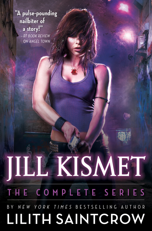
Liking the font and how the birds go with the title without being too much. Not crazy about the look on her face or how the hair is in her eyes though.
|
The yellow and brown of the background really go with her hair. The shadowing is done perfectly so it does not all blend together. Very pretty!
|

Incarnation by Emma Cornwall
|
Debut
|
Sept 18, 2012
|
Lenore's Take
|
Brandi's Take
|
Author Exclaims
|
I love this cover! She really stands out without overdoing it. The clockwork mends seamlessly into the background. I am so stoked about this book!
|
I love the background of the city and her dress. The clocks seem to overpower just a bit but overall eyecatching.
|
NA
|

Wolfishly Yours by Lydia Dare
|
Westfield Wolves #6
|
Nov 1, 2012
|
Brandi's Take
|
Author Exclaims
|
|
Not a huge fan of this cover. The colors do not go together at all, but does that guy not look like a young Leonardo Di Caprio?
|
Too busy for me. Alot going on with the couple,wolf,house and mountain.
|
NA
|

Midnight's Seduction by Donna Grant
|
Seduction #3
|
Oct 20
|
Lenore's Take
|
Brandi's Take
|
Author Exclaims
|
Not usually a fan of all one color covers but this one works. I like the knife in his hand and how she is so focused on him.
|
First, hello muscles! Nice chest and abs! The girl is kinda forgotten on this one.
|


No comments :
Post a Comment
Thank you for sharing your thoughts on NRR!
Lenore
~Media Coordinator/ Site Owner